Reflect: Mobile App
How might we facilitate conversations around health between patients with multiple chronic conditions and their caregivers?
OVERVIEW
Challenge
One in four Americans lives with more than one chronic condition. Adding a health condition requires more from the individual’s personal and financial life since they have to adapt to an intense medical routine. Consumed by the challenges of a new diagnosis, patients feel overwhelmed and need support and guidance. However, the healthcare system provides most of its attention to the relationship between patients and doctors, even though most of the time the patients are with their supporters. How can we facilitate conversations around health and make them more meaningful for patients and their supporters?
Solution
Reflect is a game-like conversation app that engages patients and caregivers to have meaningful conversations around health, using a playful, digital board game. The app provides a set of questions to help patients and caregivers address sensitive topics and facilitate mutual understanding. Engaging partner support in care-related conversations equips patients to make better health decisions and work together to overcome challenges.
This project was a finalist in the Interaction Awards 2019 in the Connecting Category at IxDA.
Scope
3 months
3 months
Categories
Strategic Innovation in Product & Service Design
Strategic Innovation in Product & Service Design
Role
UX/UI designer, researcher and
strategist
UX/UI designer, researcher and
strategist
Collaborators
Abhinav Sircar,
Kinza Kasher,
Rachel Balma
Abhinav Sircar,
Kinza Kasher,
Rachel Balma
Tools
Sketch, OptimalSort, Zoom meeting
Sketch, OptimalSort, Zoom meeting
Advisors
Aashika Jain
(Doblin- Deloitte), Criswell Lappin (Scrollmotion),
Roger Mader (Ampersand)
Aashika Jain
(Doblin- Deloitte), Criswell Lappin (Scrollmotion),
Roger Mader (Ampersand)
KEY FEATURES
Reflect is designed to bring patients and supporters together and encourages them to have meaningful conversations in a playful platform in order to better support and strengthen their relationships.

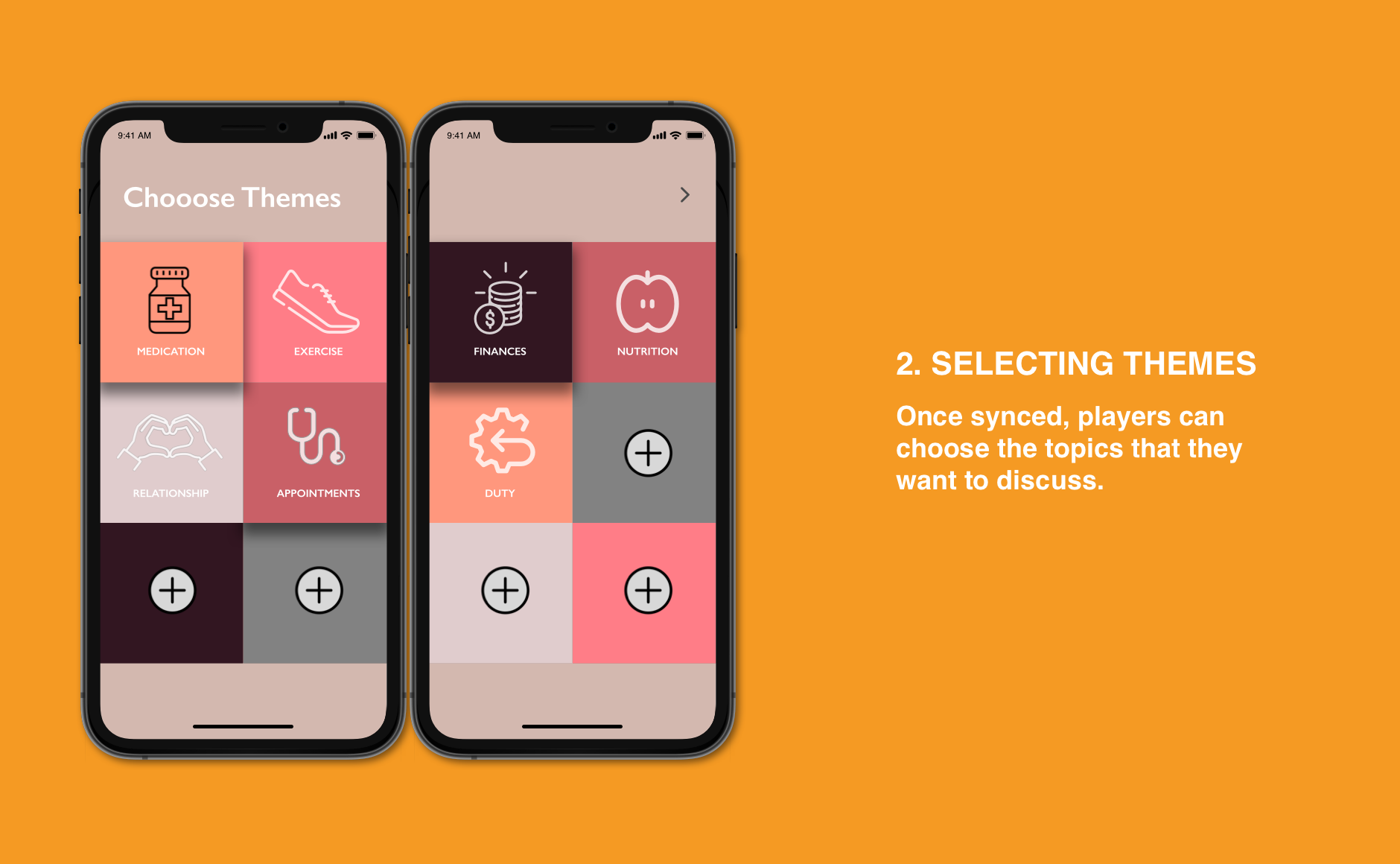
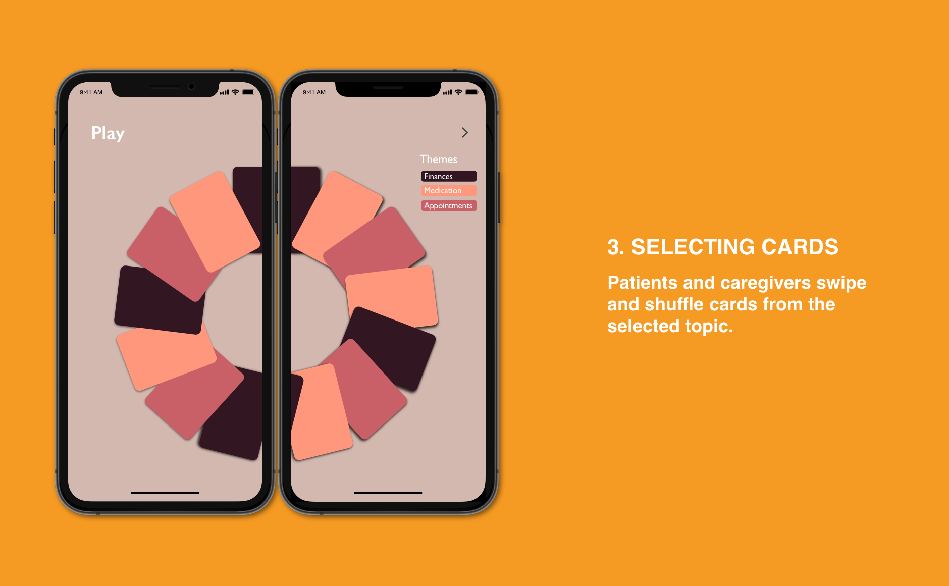
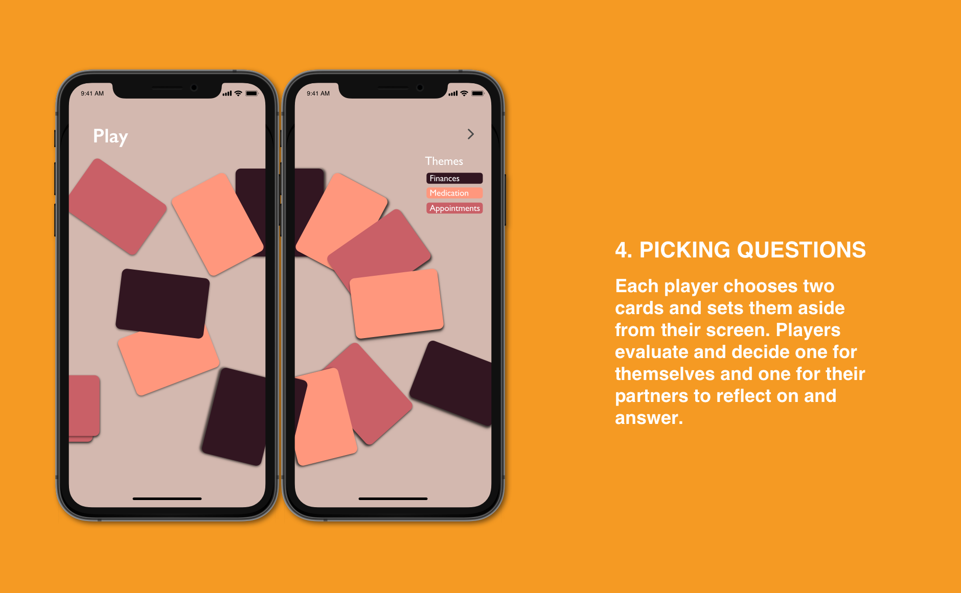
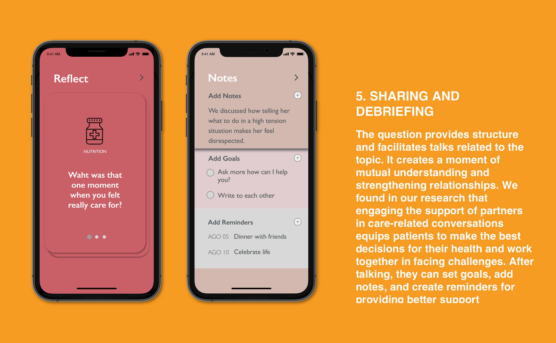
“I had never thought of questions that way, but they are things I had always wanted to know, I just didn’t know how to word them.” — Participant A's husband
AUDIENCE
We focused our research on adult millennials who were recently diagnosed with their second chronic condition. We considered them an extreme case because:
• They are dealing with many tasks such as beginning their families, careers, and studies, as well as managing the intense medical routine that a second condition requires.
• We thought that dealing with health problems at an early age might help them age with more resources.
• Their ability to take care of their health could also provide a good example for other young people around them.
DESIGN PROCESS
Understanding Users
We conducted extensive desk research and interviews with eleven patient and caregiver millennials, doctors, and experts. We looked for patient challenges and needs in their entire journey when they faced a second condition diagnosis — from seeking medical help to managing a new condition. We found common feelings that are experienced by patients and caregivers on a day-to-day basis. Here is the summary of insights from two patients:
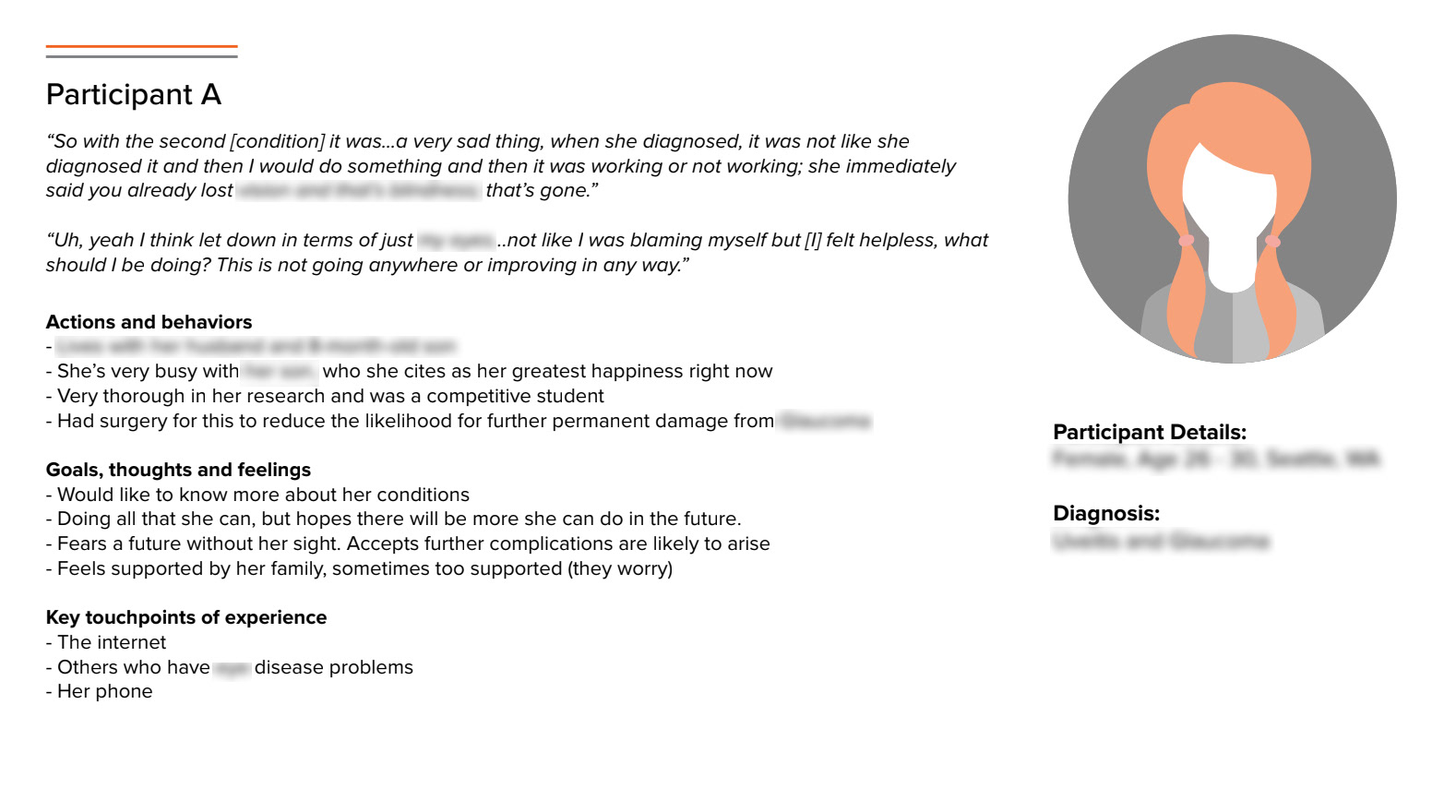
Persona A
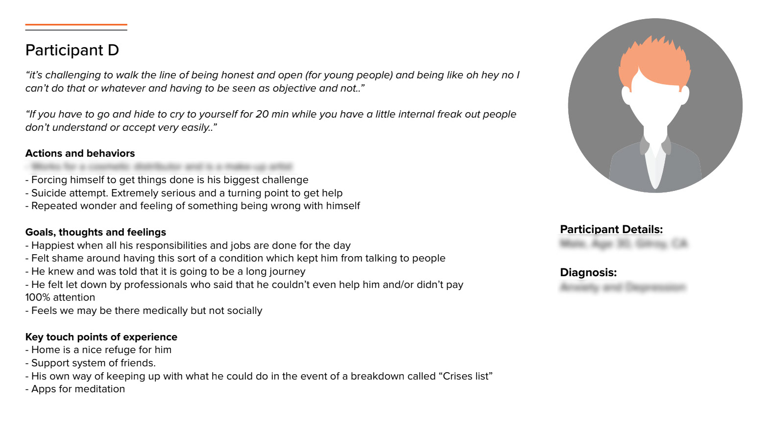
Persona B
Observation Clustering
We clustered our findings by user behaviors, feelings, and situations. Although each patient story was quite different (living with parents vs. being independent, working vs. studying, having a mental vs. a physical chronic condition), there were several overlapping features for patients and caregivers who were managing new conditions. Our findings revealed that no matter their condition, what patients value most is the emotional support they get from their loved ones.
Design Goal
Synthesis
We found patients can find themselves overwhelmed with the challenges of a new diagnosis and feel powerless, unprepared, and deeply alone, even when surrounded by loved ones. During our research, we found that even if patients and supporters are close, they often do not know what kind of help they need or how to ask for it, so quality support does not happen. We also found that conversations are an effective way to get proper support.Transforming Pain Points into Opportunities
From our research, we discovered paint points that patients and caregivers face and converted them into core features that empower them instead.
Storyboard
1. Like a board card game, Reflect brings people together.
2. Participants shuffle the cards and pick up a theme that would like to talk.
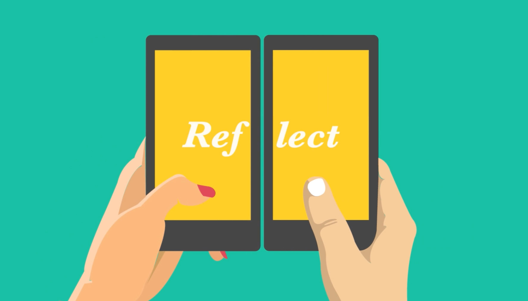

3. Each one chooses two cards, one to answer and the other to share with partner.

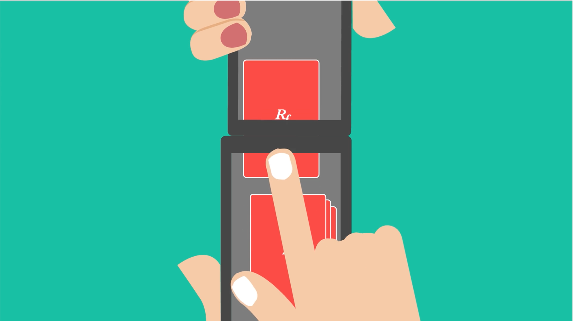
4. They reflect on their questions and when they feel ready, they start a conversation.
5. At the end of a round, they can add notes or reminder from their learnings in the app.


5E’s
To understand the user experience we analyzed the user’s thoughts, feelings, and actions throughout these five stages of using a product. It helped us to define better user flow and more empathetic interactions.
User Flow
USER TESTING
2º Round of Research
In this second round of research, we wanted to evaluate the types of questions that would be useful to patients and caregivers. We applied a card-sorting exercise to see how users would prioritize different types of health support. This helped us to create the content of the cards. We learned not only how patients seek help in managing their routines, but also the challenges they face in solving problems together and finding empathy.
Proof of Concept
We also did a survey to test our findings and validate our hypothesis in a larger audience.
DEPLOY
Extension
• There are 15 million American millennials with MCCs, but we believe that Reflect is a tool that can be used by all 62 million Americans with MCCs.
• Reflect could provide a basis for research about patients with MCCs and their supporters, by collecting users’ data.
MVP
In the first stage, we will need a short-term team of eight people and one consultancy to build the basic mobile, website, and paper cards. The digital and analog products would be released to a select group of users for a period of six months for testing and research. In the second stage, one year later, we will release the full experience more broadly.