Service Design
How might we empower museums to be more economically sustainable?
OVERVIEW
We worked with the Museum of the City of New York, a private non-profit museum, to increase the museum’s gift shop revenue by means of visitor flow optimization. Because the museum operates on a suggested donation model—in other words, no admission cost is required—the two gift shops are an important source of revenue for the museum.
After field observations, stakeholder interviews, and desk research, we synthesized our findings and found multiple approaches to lead museum visitors to the shops and encourage them to purchase more items.
PROBLEM
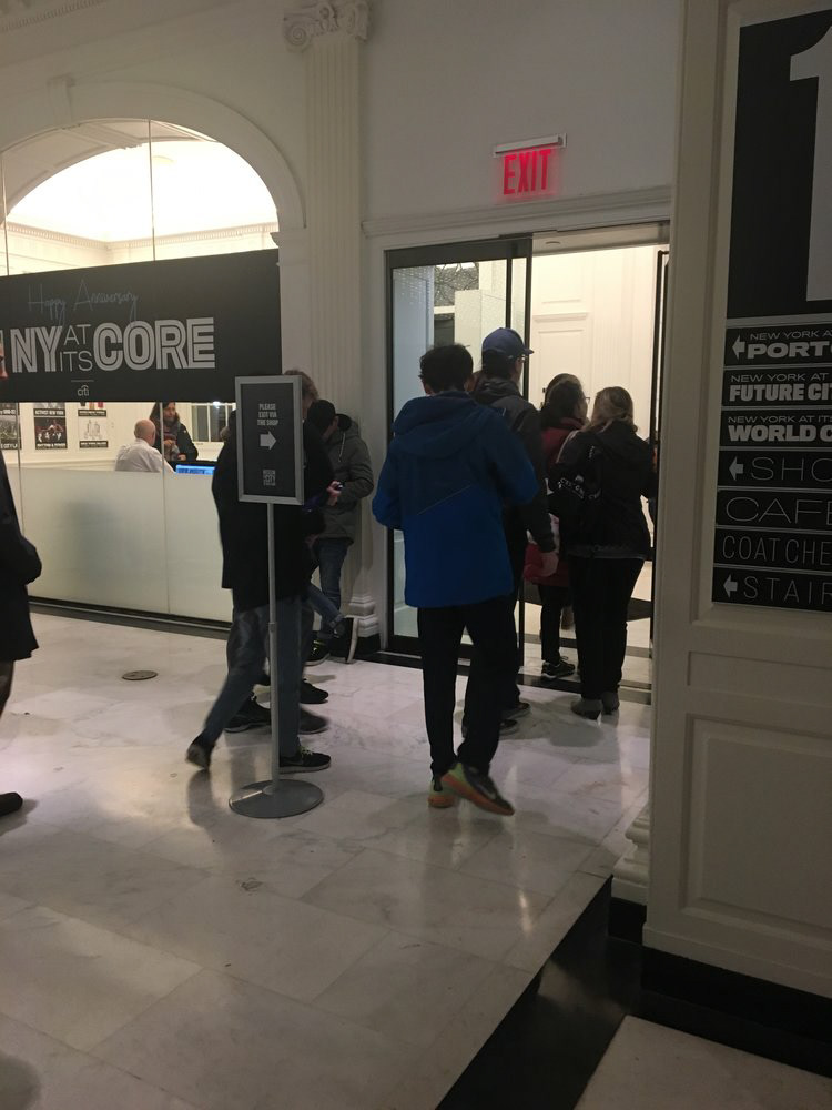
Museum visitors enter through Store A (blue line), where they get the admission ticket. However, most of them tend to exit through a large, inviting glass-door exit through the atrium (red line), and ignore the adjacent exit through Store B (green line). In the photo below, you can see the exits side by side.
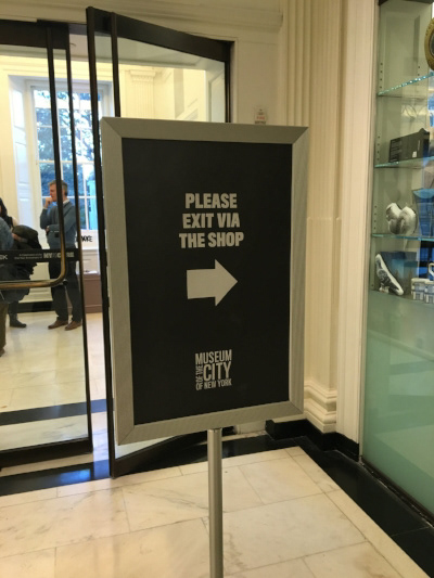
Currently, the museum tries to mitigate the loss of foot traffic through the wrong exit with a small sign directing visitors to the shop, but it is not effective at encouraging visitors to use the desired exit.


THE PERSONA
The museum brings in a wide variety of visitors, including students, families, and general native New Yorkers. However, the tour bus tourists are the museum’s clearest opportunity group, totaling to one-third of the entire visitor pool.
The number of tourists has the potential to make a large impact on the revenue. However, because the tour bus companies give the museum only 2-3 dollars per visitor, the margins on these particular visitors are extremely low; increasing their gift shop purchases would, therefore, provide the museum with more economic stability. For these reasons, we decided to make these tourists the focus of our solutions.
The tour bus tourists are typically national, from the Northeast region of the U.S. However, there are also international visitors from all over the world (Italy, France, and many Spanish-speaking countries). They are primarily adults over the age of 30 who are visiting the museum for a quintessential NYC experience and perhaps a place to rest, eat, or drink before they continue with their bus tours.
THE USER JOURNEY
We chose a circular shape to represent their journey because the museum path is ambiguous. Visitors follow diverse paths inside the museum, depending on their interests and information acquired from the map or museum staff—but here are all the touchpoints. Also, we considered the entire user journey because the needs of tourists, before and after their museum visit, can point out opportunities and drive our solutions.
THE USER BLUEPRINT
In the blueprint, we mapped the touch points of the visitors in their journey at the museum. Also, we studied the back-end action and the museum support system that serves the users.
After analyzing the current user journey and blueprint, we realized that no real incentives are offered throughout the user’s journey to lead them to exit through the gift store. Also, we were able to identify opportunities such as the museum system and touch points to improve the foot traffic into the shop.
After analyzing the current user journey and blueprint, we realized that no real incentives are offered throughout the user’s journey to lead them to exit through the gift store. Also, we were able to identify opportunities such as the museum system and touch points to improve the foot traffic into the shop.
RESEARCH
Keeping in mind the goal of leading visitors through the shops in a more natural way, we looked for how to better integrate the shops with the overall museum experience. For our primary research, we began by mystery shopping, to take our first impression of the space, to ascertain our logical flow according to current signage and layouts, and to gauge our interactions with the staff. We also observed visitors’ navigation inside the space and interviewed them. We spoke with other stakeholders in the museum such as the security guards, cashiers, and coat check staff to hear their perspective on the movement of visitors, issues they observe on a regular basis, and other pain points or thoughts. Through research, we discovered four main principles to guide our work:
1. Create awareness of gift shops during the entire museum experience
2. Arrange the store layout and merchandise in a way that makes sense for customers’ natural behavior
3. Make merchandise relevant to what customers just experienced in the museum
4. Good customer service leads to sales
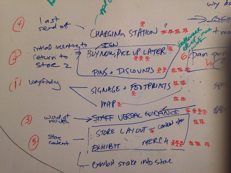
After an ideation session, we then synthesized the museum visitors major pain points and needs. We then analyzed the cost, feasibility, and necessary execution of our solutions.


PROTOTYPES
To achieve our goal, we came up with five key approaches that optimize the holistic visitor experience for increased foot traffic towards store B.
1. A "Not-So-Gentle Persuasion" exit solution
The biggest issue is the existence of two conflicting exits—through the stores and the atrium. One solution, which we called ‘Not-So-Gentle Persuasion,’ is to cover the atrium’s glass doors with large, opaque decals to clearly and naturally direct customers to the shop. Whereas the small stand-up letterboard used by the museum is currently ineffective, we instead thought of the opposite way of attracting attention. This visual cue could represent something of NYC culture. New Yorkers are known for being brash, upfront, and funny; similarly, the museum is upfront about its desire to make customers aware of its store’s products.
2. Increasing visitor activity around Store B entrance
To the north of the atrium is a large hallway with considerable foot traffic since it is close to the coat check, the permanent exhibit, the elevators, and the store. This space could be better used to direct attention to the shop. We also noticed that a few visitors were charging their cell phones in a wall outlet, and we saw a major opportunity for the museum to address this need and better use that space as a charging station. The close proximity to store B would make customers aware of the store while recharging their bodies and phones; perhaps their companions would wander into the store, increasing the likelihood of a purchase. This solution could be relatively low-budget, with seating cubes along with decals. In this case, we thought of another nod to New York, especially the history of NYC public phones. We propose using images of old public phone booths on the decals, applying them to the wall and installing a USB charging ports in the ‘change slot’ of each phone booth image. This could also be an enjoyable photo-op moment, leaving the customer with another memento.
3. Providing verbal direction from museum staff
Verbal direction from museum staff can also increase foot traffic toward to the gift shops. Visitors interact with staff members at multiple touch points, which are great opportunities to remind visitors to exit through the gift shops. Staff should greet customers warmly without being pushy. Even a smile or asking visitors about their visit can lead them to spend more time in the store. This solution is the most economical and easy to implement since the museum can use its staff; however, its success depends on the staff’s cooperation. To mitigate this risk, the museum can use its computer software, which already prompts reminders to staff members, to have them say, “Don’t forget to exit through our gift shop!” or, “Hope you have a good visit”. In addition, it will be necessary to train staff and remind them during monthly meetings to reinforce this behavior.
4. Improvising Store B's layout and content
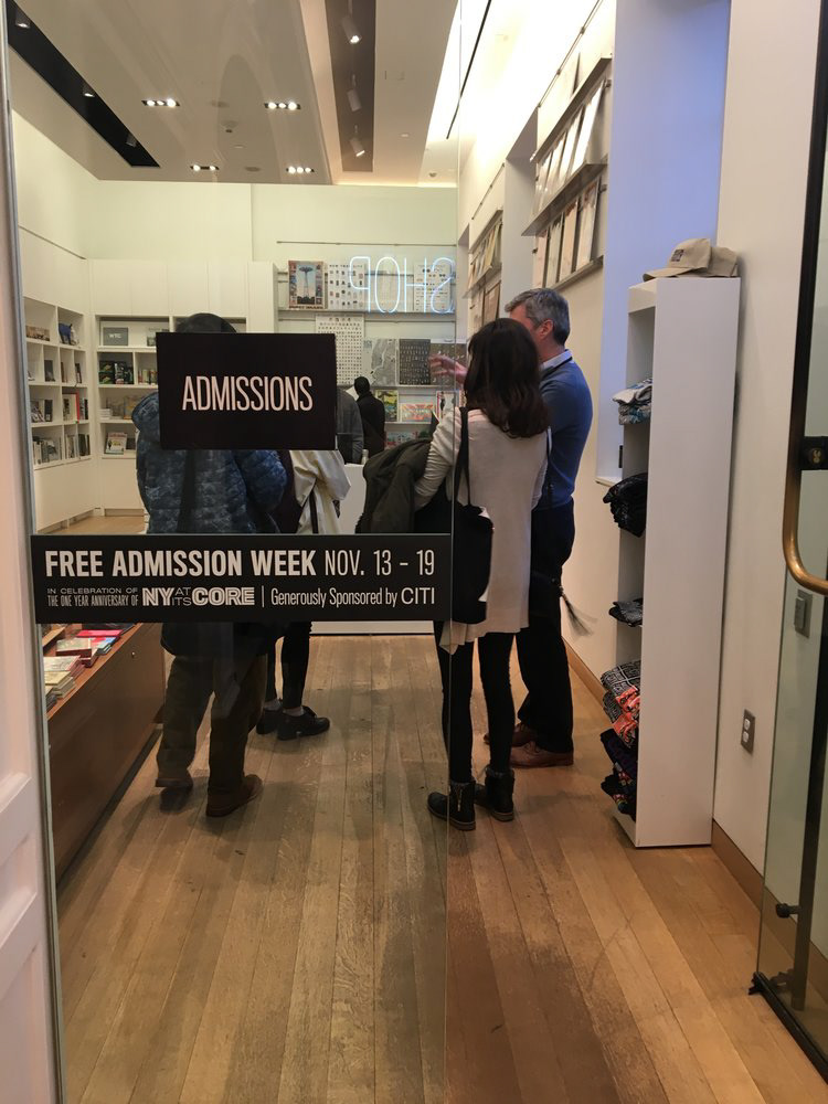
We wanted to improve the flow of the shop. Once we get visitors into space, it’s crucial that the merchandise and spatial organization resonate so that visitors want to spend time in the store and make purchases. After observing visitors and interviewing a few of them about their impressions of the store, we discovered that most people were entering the store and immediately leaving. This is likely because they were redirected to the store rather than entering out of their own volition. Moreover, the layout didn’t encourage the visitors to enter and flow into the main area.
We suggested moving several merchandise tables into the center of the space to create a more open and inviting space that after distributing the flow in a circular manner to ensure that customers have the opportunity to visit each corner of the space. In terms of store content, visitors who are impacted by a well-curated experience or specific exhibits are more likely to purchase a reminder of the museum upon leaving. We see a large opportunity at the MCNY to capitalize on some of their best exhibits by producing specialized, exhibit-related merchandise.
CONSIDERATIONS
When considering the logistics of implementing our prototypes, it is prudent to consider the actual tangible steps necessary to execute these changes.While in the future, it is worth questioning how we might increase shop revenue from an even more holistic approach, we knew that there were legitimate constraints (budget, politics, timing) around the current location of the shops and the layouts and content inside.